Space Editor
To get an overview of the Arium space editor, watch theis video (and skip to any chapter marker to go to a specific topic):
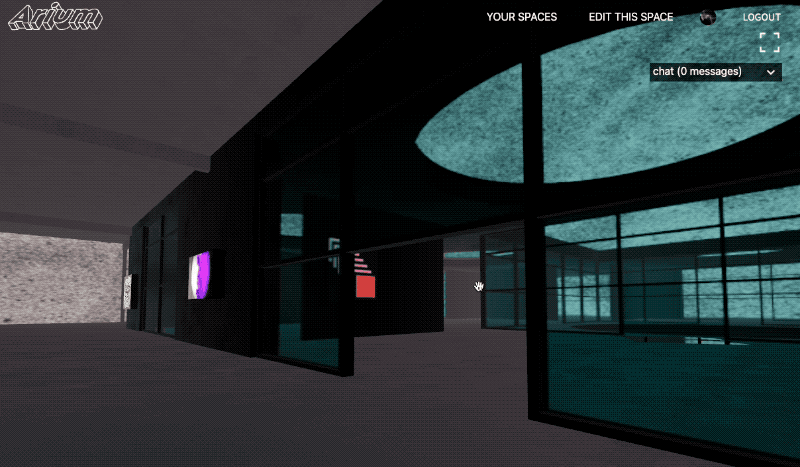
To access the in space editor, go to your spaces page and click to enter any of your spaces; once in the space the integrated editor should appear.
Elements Editor
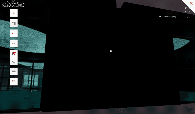
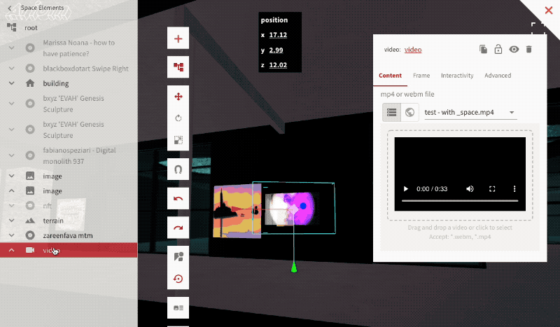
To open the elements editor, make sure the editor is visible (if not, when in the space press t). Then expand the content tree; any element can be accessed and edited from this list.
Adding an Element
To add an element, press the + icon at the top, then pick the corresponding element to add. Move the cursor around to pick where to place it; if the cursor is moved near a wall, the element will be placed aligned against the wall. Clicking will place the element, while pressing esc cancels placing it.
Once the element is placed, edit contents/details of the element in the modal on the right.
Grouping, parent & children elements
Content in the tree is hiearchical, meaning elements can contain child elements, or be children of parent elements. All transformation, visibility, deletion and other effects applied to an element will apply to all of its child elements.
To make an element a child of another element, expand the content tree and drag it into that other element.
Common element controls
To undo or redo any changes, press the undo/redo buttons on the left.
Duplicating an element
To duplicate an element, press the duplicate button. That element and all of its children will be copied, and the element will become selected.
Hiding or showing an element
To hide or show an element, click the toggle visiblity icon. This will hide or show the element and all of its children.
Deleting an element
To delete an element, press the delete button. This can be undone by clicking restore.
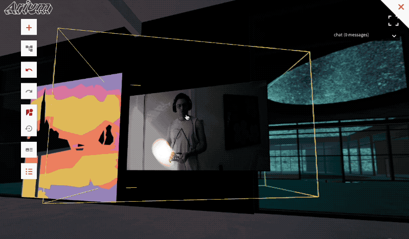
Moving, Rotating, or Scaling an element
Transforming an element means altering its position, rotation, and scale. To transform an element, expand the content tree and select the element.
Then click to either transform/rotate/or scale it. The transform values can either be modified by clicking and dragging within the space, or dragging or directly editing the values at the top of the screen.
Any children of the element will be transformed with the parent element. This means if an element is scaled, moved, or rotated, all of its children will be scaled, moved, or rotated with it. This can be a great way to group together elements and alter them proportionally.
If an element is dragged outside of its parent, it will maintain the same position/scale/rotation in relation to the whole scene as it had before.
Element Types
Model
A model element displays a 3d model file that can act as architecture, artwork, or anything 3d to be displayed in the space. Currently, Arium only accepts 3d models that are glb files.
A model's objects can be tagged with special properties, as described in the 3d modeling guide, and have its parts act as walls, be floors, or cast or receive shadows, or even be invisible for the case of a collision mesh.
A model can be made interactive.
Model Animations
If a model has built in animation, animation can enabled with a switch:
Animation speed can be controlled by editing the animation speed value; 0 is not moving and 1 is normal speed. Try entering a negative number to see the animation go in reverse!
If an animated model should appear in the same position in animation from multiple users accessing the space, as is the case with an elevator, turn on "sync to timeline." This may cause occasional jitteriness in the animation, but would make sure everyone sees the animated element in the same position.
Model Materials
A model's materials can be overridden by disabling the "bundled material" switch.
Placard
A placard enables rendering hi-quality text w/ signed distance fields (SDF) and antialiasing, using troika-3d-text; The placard component also enables the text to be rendered on top of a box with a frame.
Font size, color, alignment, box/packing color, frame color, and more can be configured
Current limitations:
- The fonts can only be selected from the list of fonts in the drop down, no custom fonts can be used.
- Only one style of font can appear in a placard, and as such, two different font sizes cannot appear in the same placard.
Underlying component used: React Three Drei's Text
Image
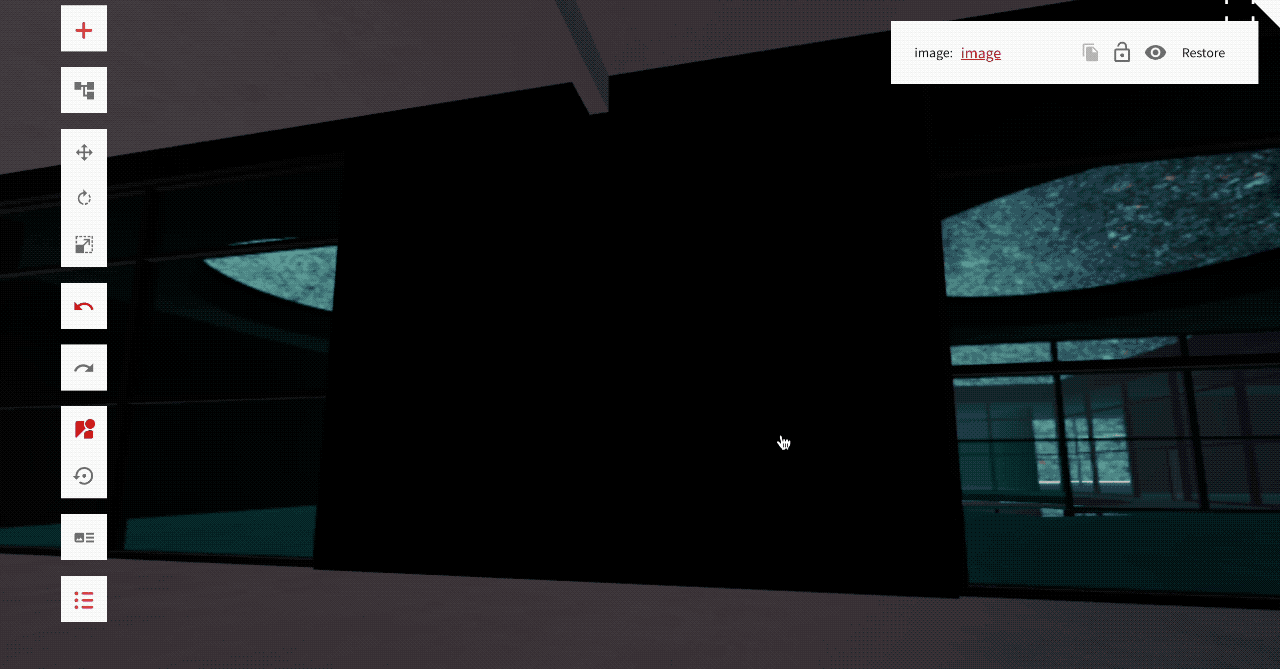
An image can be uploaded placed anywhere into the space. It's default appearance, such as the box and frame, are determined by the theme.
Image Transparency
An image can be made transparent, by enabling the transparent option and sliding the opacity scale.
Animated PNGs
Additionally, an image can be animated if it's an animated png format, and enabling the option "Is Animated PNG"
In space image resolution
Large image sizes can slow down peoples computers, as well as the load time of the space. Therefore, when an image is displayed in the space, it is resized/scaled to a reasonable resolution. A space editor can change what the resolution is by clicking on of the resolution options:
This will not affect the asset that is render in the modal that is displayed when a user clicks on the image, if interactivity is enabled.
An image can be made interactable
Video
A video enables a video file, or live stream, to be placed and played in 3d space.
For video files, mp4 is the recommended file format.
A videos appearance, including frame and box style, is determined by default by the theme. This can be overridden for each video element.
When a video should be playing
By default, videos only play if a user is near it, and looking in the vicinity of a video. This is because each video that is playing can slow down the users computer, so if many videos are playing in the space simultaneously, it'll negatively impact performance.
To have a video always play, under "Video Playback Settings" set "Auto Play" to true.
When a video is not playing, a lower resolution thumbnail is shown. The time, in seconds, of the video from when to extract this thumbnail can be configured.
Video sound, volume, and positional audio.
If a video has sound, its audio will be played from the position of where the video is, and get quiter the further away from the video the user is. The volume of the video, and the amount of decay of the audio, can be configured in "Positional Audio Settings"
Video Geometry
A video or live stream can be played on a flat plane, or projected onto a 3d goemetry, by selecting the 3d geometry option and uploading a 3d geometry. The 3d geometry should be properly UV mapped for the video file.
Light
Space creators have full control of the lighting of their space, and can do this by adding or editing lights. Be careful of adding too many lights, as lights can significantly slow down peformance. We recommend adding up to 4 maximum lights, and only one should cast shadows.
The types of lights that can be added are:
- directional - this creates a three.js DirectionalLight, described as "A light that gets emitted in a specific direction. This light will behave as though it is infinitely far away and the rays produced from it are all parallel." This kind of light is ideal for emulating a sunlight, or a light that casts long shadows.
- spot - this creates a three.js SpotLight, described as "This light gets emitted from a single point in one direction, along a cone that increases in size the further from the light it gets." Useful for illuminating certain specific elements in a space.
- point - this creates a three.js PointLight, described as "a light that gets emitted from a single point in all directions. A common use case for this is to replicate the light emitted from a bare lightbulb."
Lights can cast shadows; this can be enabled in the cast shadow menu. Casting shadows can have a big effect on performance, so use this feature sparingly.
Portal
A portal can transport a user to another point within the same space, or to another space. When configuring the portal to send a user to another space, the list of spaces that can be selected are limited to the ones that the user editing the space has editor access to.
A portal can be invisible, and any kind of 3d model can be placed at position of the portal to make the portal appear how the space creator desires.
Terrain
A terrain generates a 3d terrain from a grayscale image. This grayscale image can be manually created in a photo editing program, generated from a real world location, or generated using a web based tool.
Built using THREE.Terrain
Group
A group is an empty placeholder that can be used to group elements and modify them together.
Screen Share
A screenshare can be used to share a users screen and audio, in real-time, into 3d space. The only way audio can be shared is from chrome, by sharing a chrome tab, and checking the box "share computer audio"
Only one of these should be added per space.
Broadcast Zone
When a peer is in a broadcast zone, the audio of that peer can be heard from the whole space, regardless of how far the peer is. This acts as a microphone, and is useful for in-space live interactive talks or performances.
Reflector Surface
A reflector surface acts as a mirror, or can be used as a reflective floor. Each reflector renderes a copy of entire the scene, and can significantly impact performance, so try to use one of these at the maximum.
Built using the React Three Drei Reflector
Water
A water element is like a reflector that appears waterlike. Each water element renderes a copy of entire the scene, and can significantly impact performance, so try to use one of these at the maximum.
Built using the three.js water2
Text
Text enables a bit of 3d geometric text to be dropped into the space. Currently the font cannot be changed.